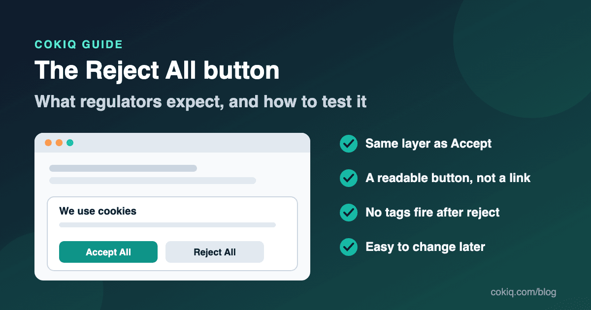
Most cookie banner complaints are not about missing banners any more. They are about banners that make saying yes easy and saying no slow: an Accept All button up front, and the refusal option two clicks deep, hidden as a grey link, or missing altogether.
That pattern is exactly what European and UK regulators have been checking for. This guide explains what they have said about the Reject All option, which design choices they treat as misleading, and a short test you can run on your own site today.
What regulators have actually said
The EDPB Cookie Banner Taskforce (January 2023)
The European Data Protection Board set up a taskforce of national authorities to coordinate their response to hundreds of similar cookie banner complaints. Its report, adopted on 17 January 2023, is the closest thing to a shared EU view on banner design (EDPB report). On the reject option it found:
- No reject button on the first layer. A vast majority of authorities considered that a banner which offers a consent button on a layer, without a refuse, reject or "not consent" option on that same layer, does not meet the requirements for valid consent. A few authorities disagreed because the ePrivacy Directive does not mention a reject option explicitly, so treat this as the dominant view rather than a unanimous rule.
- Reject as a link. Banners that offer refusal only as a link like "continue without accepting" buried in a paragraph, or placed outside the banner frame, without enough visual support to draw attention to it, were listed as examples that do not lead to valid consent.
- Button colours and contrast. The authorities agreed that a general colour or contrast standard cannot be imposed and that each banner needs a case-by-case check. They named at least one practice as manifestly misleading: an alternative button whose text contrast is so low that it is unreadable to virtually any user.
- Pre-ticked boxes. Pre-ticked category boxes on the settings layer do not produce valid consent.
- Withdrawal. Withdrawing consent must be possible at any time and as easy as giving it. The taskforce did not require a specific mechanism, but gave a small, permanently visible icon or a link in a visible, standard place as examples.
The UK ICO's top-1,000 review (December 2025)
On 4 December 2025 the Information Commissioner's Office reported on its review of the UK's 1,000 most-used websites (ICO announcement). It checked three things, and one of them was whether rejecting non-essential advertising cookies was as easy as accepting them. The ICO said 979 of the 1,000 sites met its checks at their most recent test, many only after letters, investigations or preliminary enforcement notices. It also said it will keep testing these sites periodically, and that one visible change from its work is a greater prevalence of "reject" options on cookie banners.
The underlying rule
Both positions come back to the consent conditions in the GDPR. Article 7(3) says it must be as easy to withdraw consent as to give it, and Recital 32 says silence, pre-ticked boxes or inactivity do not count as consent (GDPR text on EUR-Lex). If accepting takes one click, refusing should not take three.
This article is practical guidance, not legal advice. Requirements differ between markets. US state laws, for example, are mostly built around opting out of sale or sharing rather than prior opt-in consent, so check with qualified counsel for your own situation.
Design patterns that cause trouble
Using the taskforce findings as a guide, these are the patterns most likely to be challenged:
- Accept All plus "Settings", with no reject on the first screen. Visitors who want to refuse have to open a second panel and untick categories, while accepting takes one click.
- Reject styled as body text. A small underlined "decline" inside a paragraph is easy to miss. If you show it at all, show it as a button.
- Unreadable reject button. Pale grey text on a white button, or a transparent button with no border, can make the option effectively invisible. Brand colour on Accept is fine; an unreadable Reject is not.
- Different wording weight. "Accept and continue" next to "I'd rather have a worse experience" pushes people. Neutral, parallel labels such as Accept All and Reject All are clearer.
- A banner that comes back after every reject. If the refusal is not remembered, visitors are asked again and again until they give in. Store the choice and respect it.
- Reject that does nothing. The most common real-world problem is not the button, it is the wiring. The button records "rejected" while the analytics or ad tag was already loaded from a theme file or a tag manager trigger that ignores consent.
A 10-minute Reject All test for your website
You only need a browser and its developer tools. Use a private window so there is no stored consent.
1. Check the first layer
Load your homepage. Is there a Reject All (or equivalent) button on the same layer as Accept All? Is it a real button, readable, and roughly as easy to reach on mobile as Accept? Take a screenshot.
2. Record what loads before any choice
Open the Network tab, reload, and do not click the banner. Filter for common tracking hosts such as google-analytics.com, googletagmanager.com, doubleclick.net, facebook.net, connect.facebook.net and clarity.ms. In the Application or Storage tab, note any cookies already set. Anything non-essential at this stage is a problem regardless of what the buttons say. Our guide to cookie scanning explains why a scan alone will not catch all of this.
3. Click Reject All
Clear the Network log, click Reject All, then browse to two or three other pages, including one where you run ads or embeds. Advertising and analytics requests should not appear, and no new non-essential cookies should be written. If you use Google tags with consent mode, the requests that do appear should carry denied consent states.
4. Reload and confirm it was remembered
Reload the page. The banner should not reappear immediately, and the tags should still be off.
5. Change your mind
Find the way back to your choices, for example a cookie settings icon or a footer link. Switch to accept, confirm the tags now load, then switch back to reject. Withdrawal should be about as quick as the original choice.
6. Repeat on mobile
Banners are often redesigned for small screens, and that is where reject buttons tend to get squeezed into links. Run steps 1 and 3 on a phone or in mobile emulation.
Save the screenshots and a short note of what you saw, with the date and URL. If someone asks how your banner behaves, that evidence is much more convincing than a screenshot of a settings page. Real visitor choices belong in your consent records.
How the COKIQ banner handles Reject All
If you use COKIQ, here is what the banner script does today, so you know what to check and what you still own:
- Reject All sits next to Accept All on the first layer. Both are buttons. The banner editor saves Reject All as enabled, and you can change its label. Accept uses your primary brand colour; Reject uses a neutral button in the banner's text colour, so it stays readable. If you change colours, re-check the contrast yourself.
- Rejecting sets every non-essential category off. Clicking Reject All stores a choice with analytics, marketing and preferences set to false, applies it, and remembers it until it expires or you ask for re-consent.
- US visitors see a different label. Under the US regulation profile, the second button reads "Do Not Sell or Share", which fits opt-out laws better than "Reject All".
- There is a way back. After a choice is made, the script shows a small "Manage cookie preferences" button so visitors can reopen their choices. Developers can also call
Cokiq.showBanner()from a footer link.
What COKIQ cannot do on its own is stop a tag that is hard-coded into your theme or fired by a tag manager trigger that ignores consent. That is why step 3 of the test matters. The banner customization docs show the available options, and the free website scan is a quick way to see which tracking scripts your page source loads before you start. For visual inspiration, see our cookie banner examples.
Quick checklist
- Reject All (or "Do Not Sell or Share" for US opt-out) is a button on the first layer, not a link
- Both buttons are readable on desktop and mobile
- Labels are neutral and parallel
- No category boxes are pre-ticked
- No analytics or ad requests before a choice, or after Reject All
- The refusal is remembered on reload and across pages
- Changing your mind takes about as many clicks as the first choice
- You have dated screenshots of the test
If your site also receives Global Privacy Control signals, add the browser-signal test from our GPC testing checklist. When you are ready to put a banner with a real Reject All in place, compare COKIQ plans.